What’s a Landing Page - How to create conversion tracking landing page
A Landing Page or a website Landing Page is a standalone web page, which usually separate from the main website, however it represents the specific goal, like capturing leads, promoting a product, paid marketing ads, collecting leads moreover encouraging users to take an action. It focused and free from distractions, often linked to marketing campaigns, ads, email promotions.
A landing page designed for exactly for certain group of people, and the whole content, pricing, and layout get designed based on the target audience. Businesses are more focused on create conversion tracking landing page.
A landing page is one of the most powerful tools in digital marketing. Its sole objective? Drive action—whether that's making a purchase, signing up for a service, or registering for an event. But not all landing pages are created equal. If made without purpose or strategy, even the best product may fail to convert visitors.
Types of Landing Pages
Not all landing pages serve the same purpose. From capturing leads to closing sales, each type plays a unique role in customer engagement. Below are the key types of landing pages, complete with their purpose and examples:
1. Lead Generation Landing Page
These pages collect user details (name, email, etc.) through a form, often in exchange for something valuable like a free trial, ebook, or webinar.
Best for: SaaS businesses, content marketers, and online educators.
Example: A SaaS landing page offering a "14-Day Free Trial" by asking for an email and basic details.
2. Click-Through Landing Page
Acting like a teaser, this type provides crucial information and pushes visitors to take the next step—typically clicking a button to visit a product or purchase page.
Best for: E-commerce and paid ads.
Example: A mobile app landing page showcasing features with a “Download Now” CTA.
3. Sales Landing Page
These pages are geared entirely toward converting visitors into paying customers. They highlight product benefits, include compelling CTAs, and often leverage reviews or testimonials.
Best for: E-commerce stores or service providers running direct promotions.
Example: A "50% Off Winter Collection" plumbing paid ads landing page with buy-now links.
4. Squeeze Page
Designed with simplicity in mind, these pages are laser-focused on one goal—usually collecting email addresses in exchange for a small incentive.
Best for: Marketers building newsletters or communities.
Example: "Subscribe now for exclusive discounts & freebies" with an input box for email address entry.
5. Thank You Page
Often overlooked, this page is displayed after a user successfully completes an action (such as form submission or payment). It's an opportunity to confirm their interaction and lead them to additional actions.
Best for: Post-action engagement.
Example: “Thanks for subscribing! Check your inbox for our exclusive guide.”
6. Event Registration Page
Created to encourage sign-ups for events, webinars, or workshops. These focus on event details and make registration simple.
Best for: Event organizers or businesses hosting workshops.
Example: A “Reserve Your Spot Now” event-specific landing page for a business seminar.
7. Coming Soon Page
Designed to build hype by teasing an upcoming product, service, or launch. Often paired with countdown timers or email capture fields.
Best for: Startups building interest pre-launch.
Example: A page highlighting the features of an upcoming app with a “Be Notified at Launch” button.
Each of these pages plays a unique role in digital strategies, ensuring your marketing efforts stay focused and impactful.
How to Create a Conversion Tracking Landing Page
A high-performing landing page isn’t an accident—it’s the result of careful planning, testing, and optimization. Here’s a step-by-step guide to creating one:
1. Find the Purpose
Start by defining the goal. Is it to capture leads? Promote a product? Encourage users to sign up for an event? Defining the purpose ensures that everything on the page aligns with that objective.
For example, if you’re developing a SaaS landing page for free trial sign-ups, your CTA and supporting text should focus on ease of access and no-risk terms.
2. Make the UI First to Plan Visually
Before jumping into development, sketch out or prototype your design. Tools like Figma or Adobe XD are perfect for this. Focus on clarity, eliminate distractions so the audience’s attention is fully on your call to action.
Use best landing page layouts with webforms for smooth user interaction.
3. Design Catchy, Clear Call-to-Action (CTA) Buttons
Your CTA button isn’t just there for clicks, it’s the bridge between users and conversions. Use compelling verbs like “Get Started,” “Claim Your Spot,” or “Discover Your Savings.” Make the button stand out with contrasting colors or bold text.
4. Choose the Right Technology for Development
Pick a platform that balances ease of use and customization. Popular choices include:
-
WordPress Landing Pages in Divi: Perfect for those who want flexibility with minimal coding.
-
Webflow: A design-first platform that combines the power of a CMS with the flexibility of visual web design for landing pages.
-
Wix: An easy-to-use builder with customizable templates and a simple interface for creating landing pages.
-
Squarespace: Known for its visually appealing templates and easy customization for landing pages.
5. Create High-Quality Content
The content on your landing page must be clear, persuasive, and concise. Visitors should immediately understand the value you're offering. Use headlines that grab attention and body text that supports your CTA by emphasizing benefits.
For instance, in an eCommerce landing page, highlight features of your product, its limited-time discount, or how it stands apart from competitors.
6. Integrate Conversion Tracking Tools
Setting up tools like Google Analytics, Facebook Pixel, or HubSpot enables you to measure results effectively. Track metrics like click-through rates, conversion rates, and bounce rates to know exactly how your page is performing.
7. Use a Clear and Easy Contact Option
Eliminate any friction in communication. Add forms that are simple to fill, live chat widgets, or even clickable phone numbers that encourage visitors to act immediately.
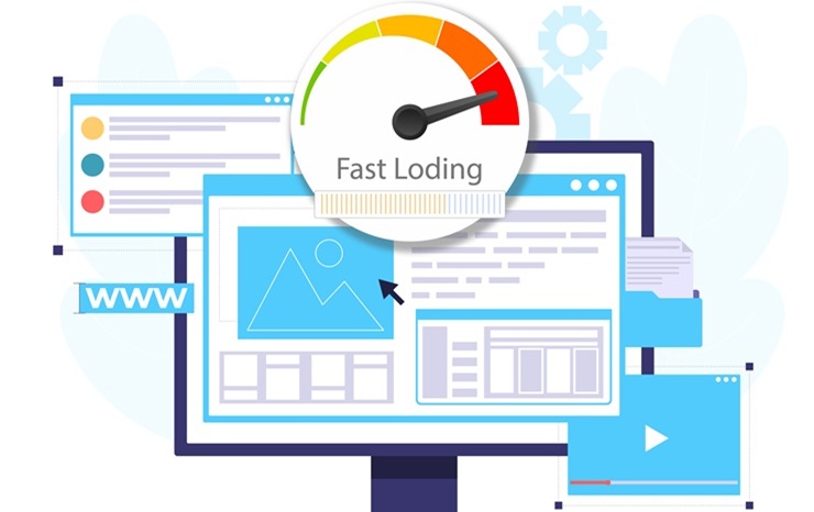
8. Make It Mobile-First Optimized
With more than 80% of online traffic coming from mobile devices, it's non-negotiable to prioritize mobile-friendly designs. Ensure fast loading speeds and responsive layouts.
9. A/B Test
You’ll never know what works until you test. Experiment with different headlines, layouts, and CTAs. Look for patterns in which versions deliver the highest conversion rates.
Fun stat for you, 33.7% of marketers see higher conversion rates from these improvements compared to the previous year. Source: HubSpot
10. Launch and Monitor
Finally, it’s time to launch! But don’t set it and forget it. Monitor performance, making adjustments to optimize your page over time.
Which Landing Page is Right for Your Business?
Your industry and goals will determine the best type of landing page to use. Here are examples by business type:
-
E-Commerce (Sales Landing Pages)
Encourage direct purchase with urgency-driven CTAs like “Buy Now” or “Limited Offer.”
-
B2B (Lead Generation Pages)
Offer whitepapers or guides in exchange for contact details. Use trust signals like “featured in…” logos for credibility.
-
SaaS Companies (Free Trial Pages)
Focused on clear CTAs, like “Start Your Free 7-Day Trial.”
Example: The classic app SaaS landing page.
-
Health/Wellness (Appointment Booking Pages)
Simplify bookings with forms or calendar integration, ensuring customers can schedule with ease.
Now’s the time to put this knowledge into action. Create conversion tracking landing pages that not only look great but also deliver measurable results. Need help? Reach out to our team, and let's start designing a landing page tailored to your goals.