Usersnap – Webflow Design and Development

Project Overview
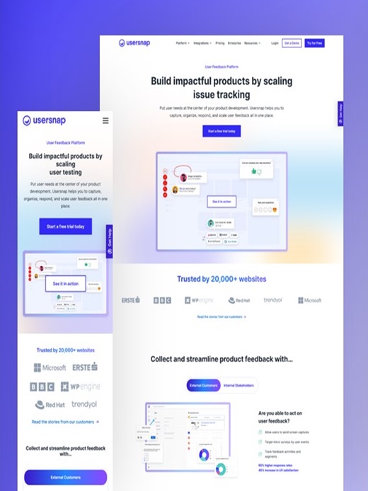
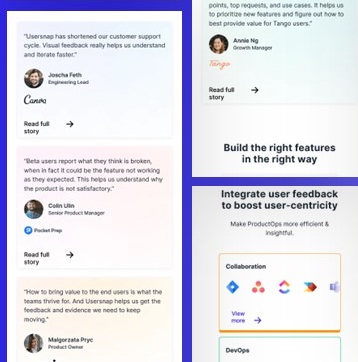
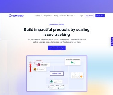
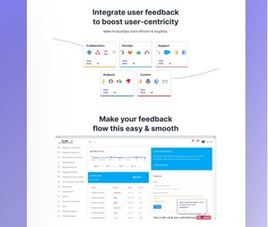
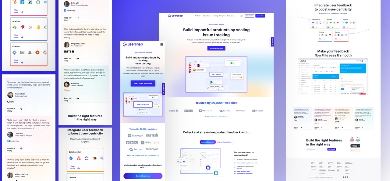
baseTOP was tasked with designing a sleek and functional website and landing page for Usersnap using Figma. The focus was to create a clean, minimalist interface that enhances usability and reflects Usersnap’s professional brand.
The goal was to implement clear CTAs, a refined color palette, and a responsive design that guides users effectively through their product offering.
|
The Problem Usersnap needed a clean and professional website with a user-friendly interface to better communicate their product's value and streamline the user experience. |
 |
 |
The Challenge We needed to design a layout that balanced a minimalist aesthetic with clear, effective navigation. Additionally, ensuring a consistent brand color palette and optimizing the design for mobile responsiveness were key challenges. |
|
Solution baseTOP utilized Figma to create a modern, responsive website and landing page. The design incorporated consistent brand colors, clear CTAs, and a user journey that guided visitors from feature exploration to action, focusing on simplicity and engagement. |
 |
Design Output
Platform: Figma
Key Features:
Clean, minimalist design for clarity
Brand colors: Purple and white
Responsive design for all devices
Easy user flow from info to action
Interactive demos and videos
Brands Trust Us


our work showcase
Explore similar portfolio
you might like it
Have a project in mind? Lets discuss!
simple work process
Check How We Works in
3 Easy Steps

Meeting
Our process starts with a meeting to deeply understand and align with your vision.

Development
After our initial meeting, we shape the development process around your specific needs.

Finalizing
We refine and finalize the development, deliver the results that meet your goals.
